Case Study 1: Biscuit Package Experience
Present problem: Packaging has become a massive role in the food industry, especially regarding chips & biscuits. Children are the most significant profit in sales of biscuits even though it’s something people of all generations love to eat. But the problem seems to be the packaging where the anticipation of unwrapping a biscuit cover appears to be a downgrade of interaction experience to biscuits directly articulating the resulting frustration, uneven unwrapping.
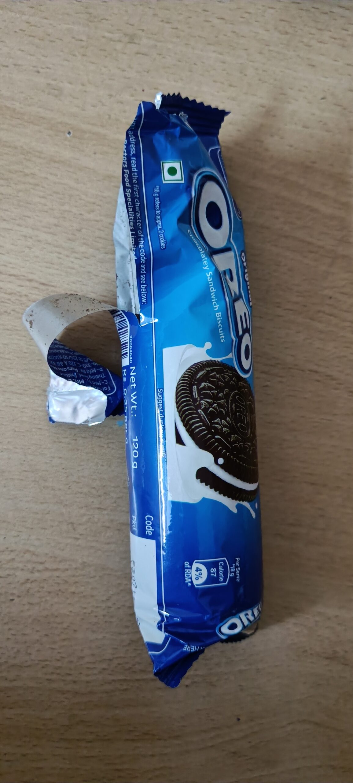
Experience: When I recently brought a few biscuit packets, I started to open them. A disaster hit me upon how uneven the wrapper goes by tearing up and how the biscuits must be picked out of the package with the utmost difficulty.
Raw solution: It’s always simple, so one of the packages which my sister tore was the solution amazingly. Here it is 
RAW SOLUTION VISUALIZATION
Final solution: From this, we can see the cover is torn so that the biscuits can be picked quickly, whereas the experience is minimal to no frustration over packaging. And the below design could be the final solution where the packaging has the person indicating where the peel-off is and how the peel of tracing lines are shown along the graphic element of the packaging.


